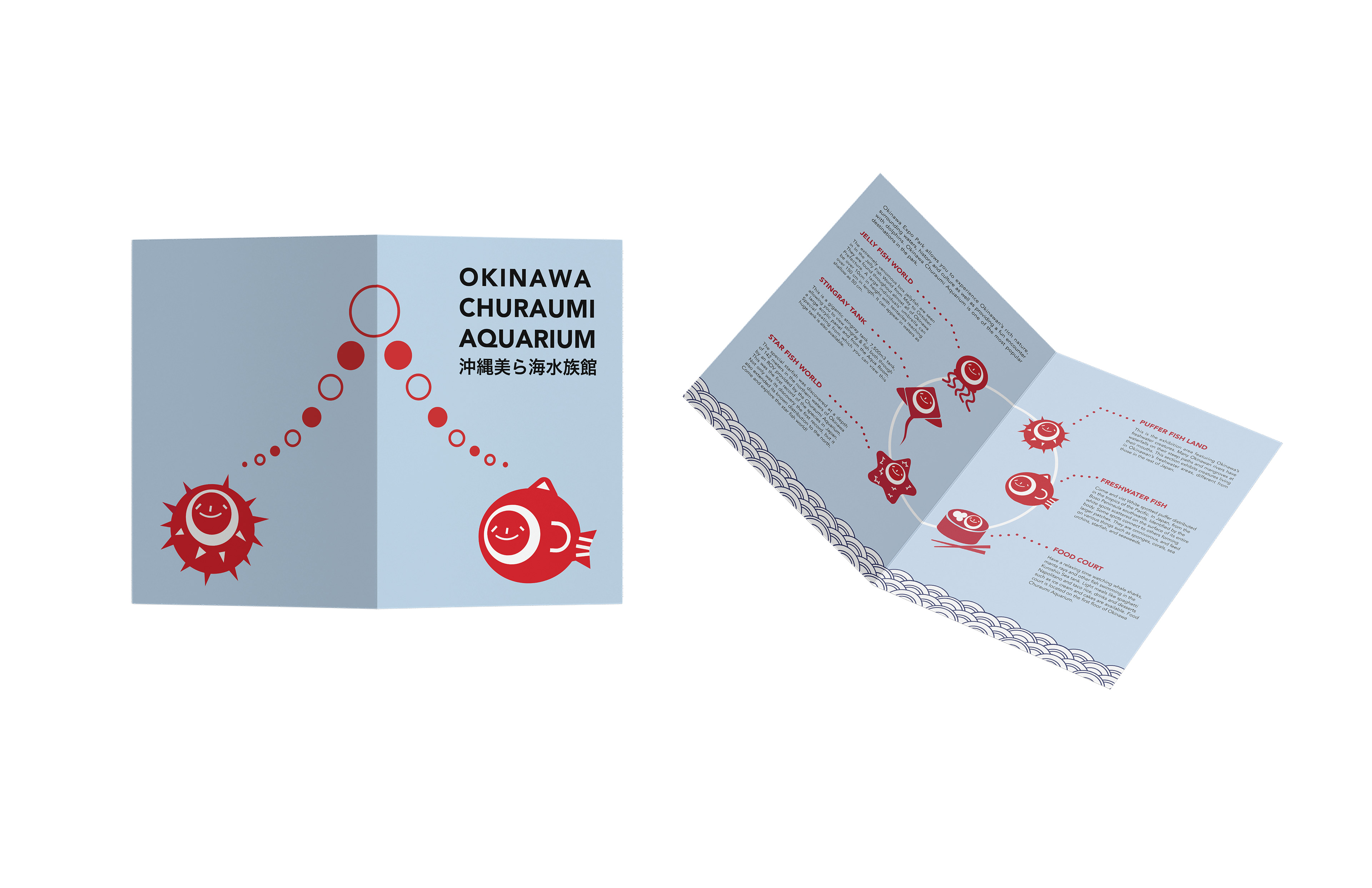
I was inspired by the design needs of a high-traffic space with many visitors.
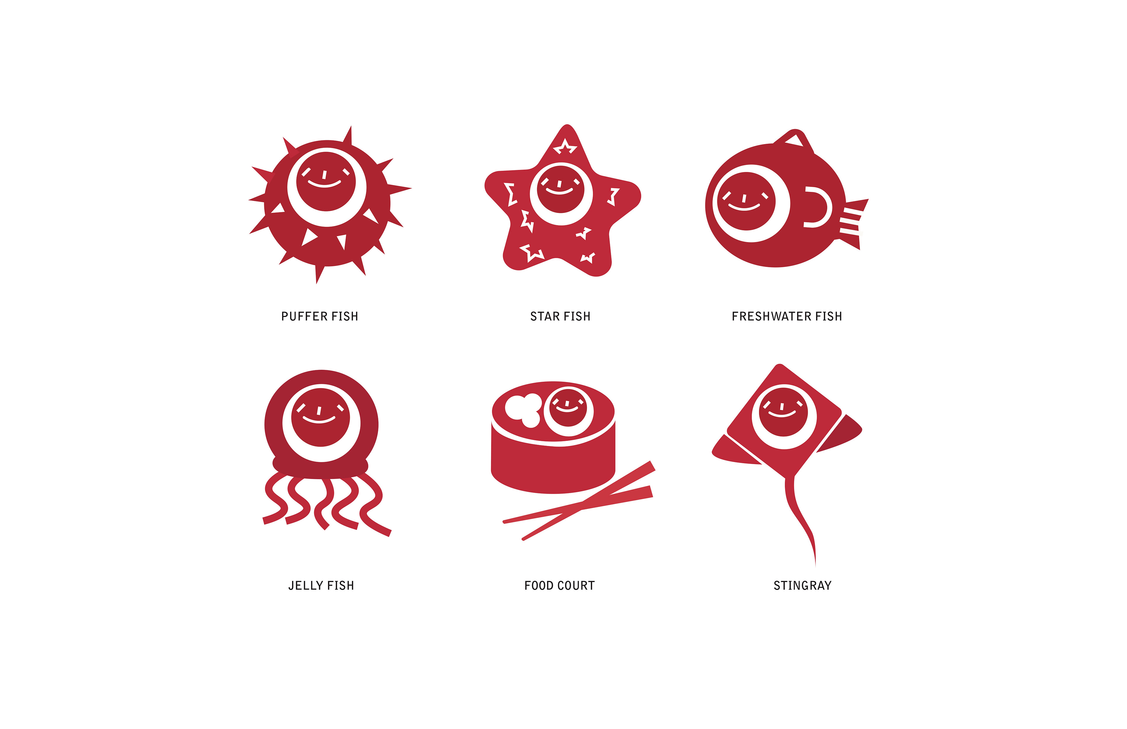
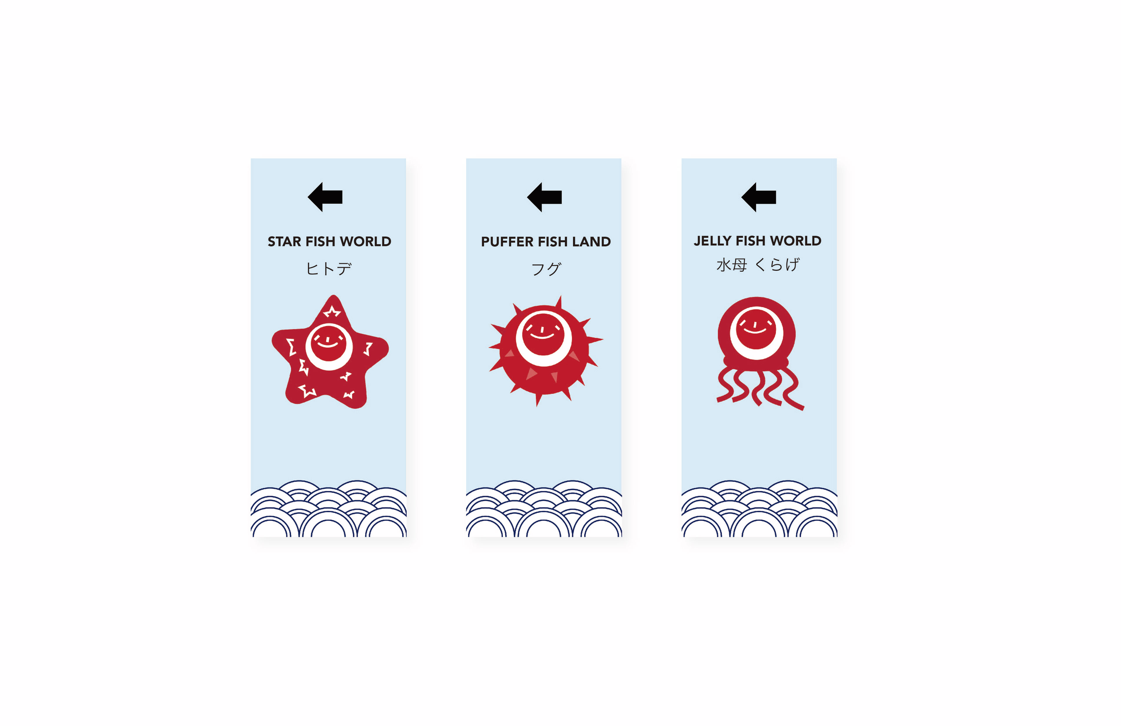
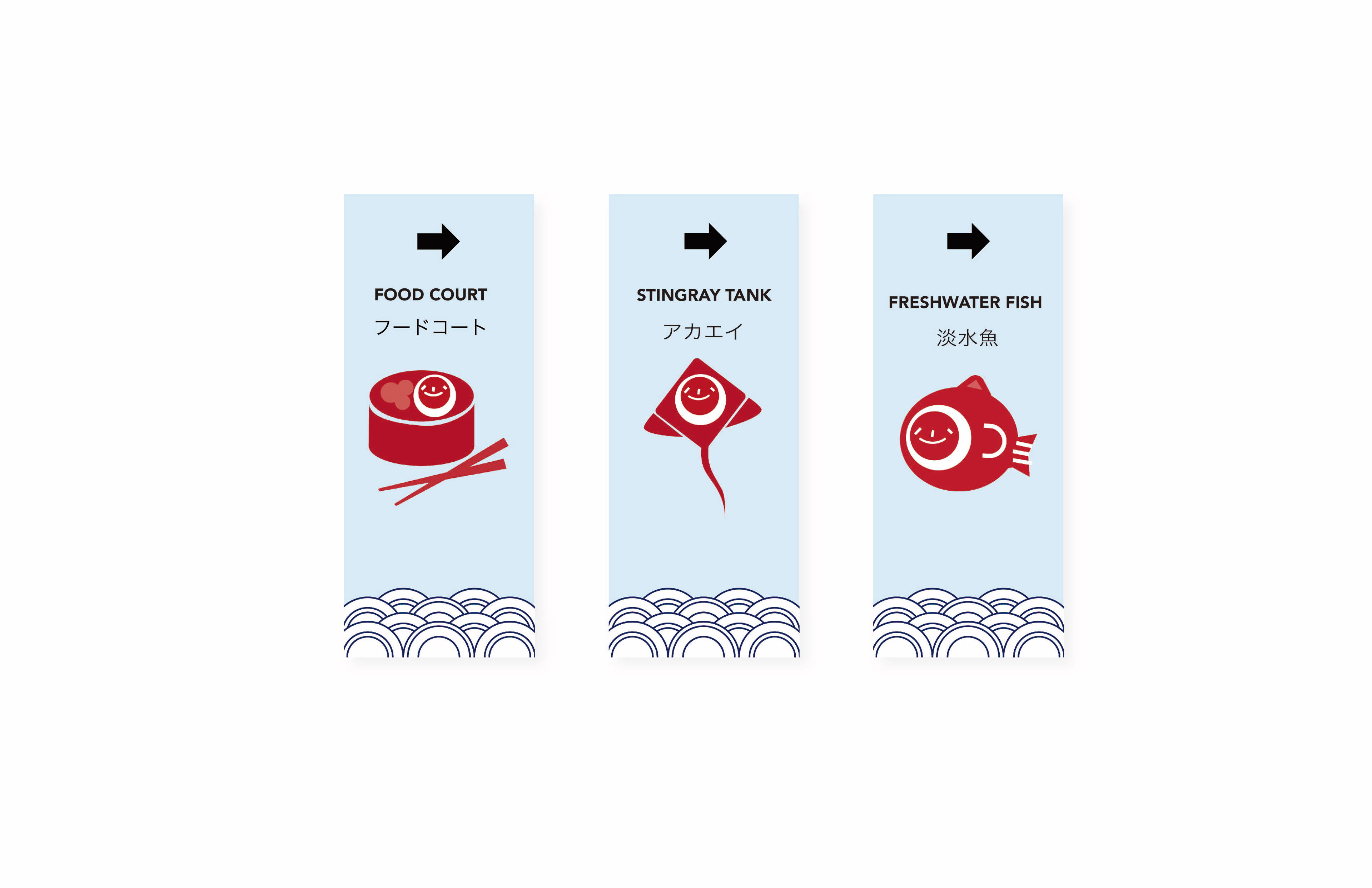
To assist guests with navigation, I created a set of wayfinding icons. Drawing from the Japanese flag, which features a red circle on a white background, I designed sea animal icons with red circular faces to reflect cultural influences.
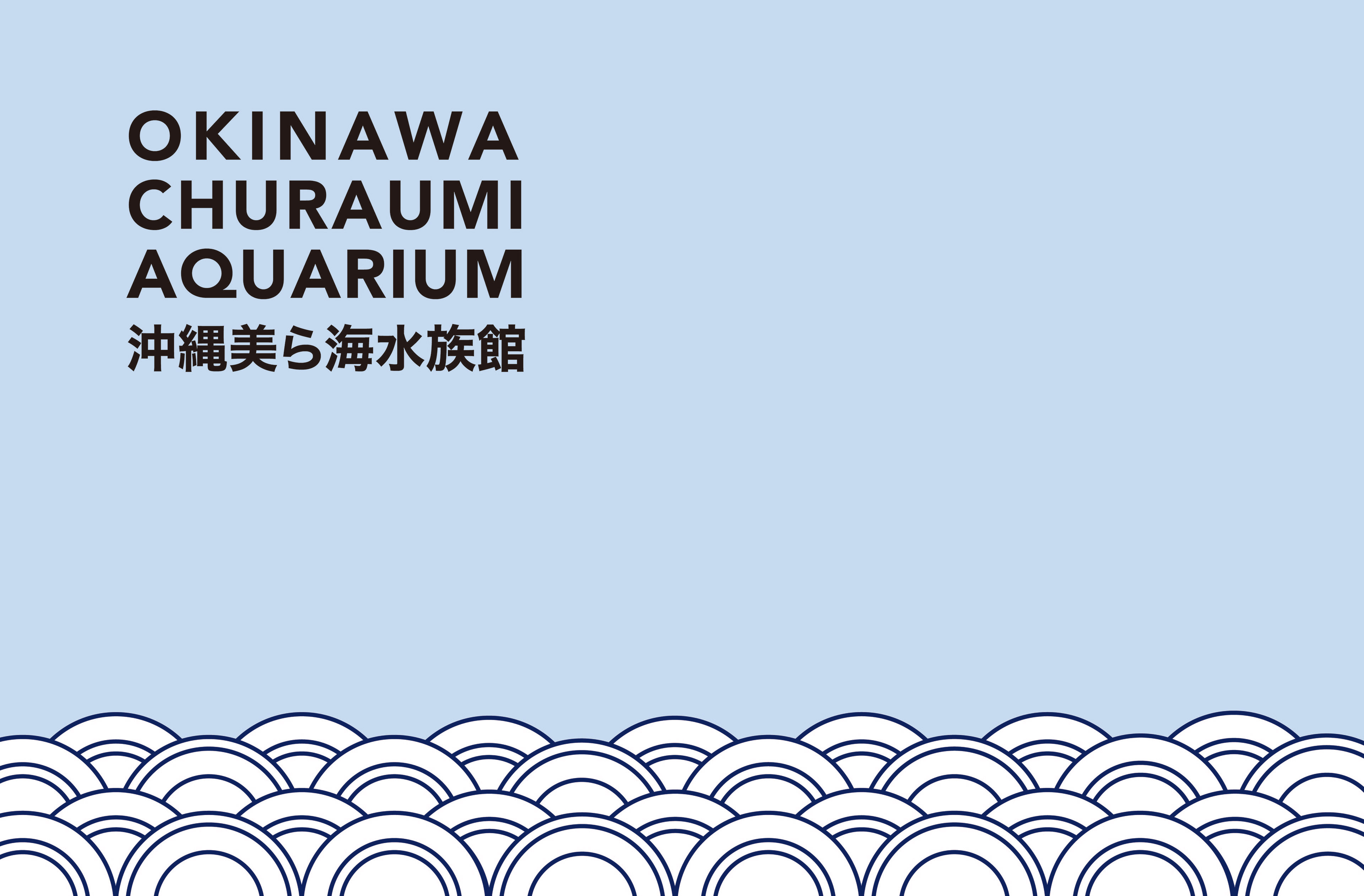
To maintain a clean and calming oceanic vibe, I used a light blue background for the signage, complemented by a Japanese wave pattern at the bottom.
This allows the signs to blend naturally into the environment while ensuring the red icons stand out for easy navigation.
The icon set was also used in print collateral and brochures, providing consistency across all materials. I kept the theme cohesive and engaging throughout the project by incorporating circular elements and subtle red accents.